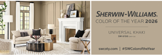
This year as every year, a host of companies proclaimed the color of the year. The Pantone Color Institute declared Living Coral would be turning up “in your clothing, tech gadgets, home decor and more” in 2019. PPG named Night Watch, “a rich, luxurious and classic shade of green,” as suitable for healthcare, commercial, and residential applications. Benjamin Moore went with Metropolitan, a “calm, composed, and effortlessly sophisticated” shade of gray that “exudes glamour, beauty, and balance.” “Forged by sun. Fired by desert,” is how Sherwin-Williams described Cavern Clay, its reddish pick for Color of the Year. Behr named Blueprint its color of the year, and the chalky blue hue can easily be imagined in all rooms, whether it’s a kitchen, bedroom, or basement, according to the promotion.
Who is going to repaint their home based on annual trends, you ask? According to Eric Mandil, color expert and principal of Mandil Inc., the color of the year declarations can serve as inspiration, and as things to sell and talk about. They are, he says, “the visual appetizer.” He further explains: “It’s about selling furniture, not a room.”

Realtors have conditioned people to think about resale value. “We live in a realtor beige and gray world. Realtors and contractors don’t want to do custom colors. People get trapped, caught up in trends. No one wants anything too flavorful.” Who knows, when people are shopping for a home, maybe the kitchen with a red island will be memorable and that will draw the buyer to that house. Mandil recommends going with color that is artful, not trendy. “People should look good in the colors around them. Bright pink and bright yellow are hard colors. There are flavorful neutrals as well. If you copy mother nature, all four seasons, it’s not trendy.”
What you’ve been raised with often determines your color preferences. “European is a whole different color sense. New York and Chicago tend to use more saturated colors. The South is more at home with color than some other areas. Florida is something of a ‘theme park’ when it comes to color,” Mandil says.
Color palettes work differently in different areas. “Tonality is how it grays down. Here [in Colorado] we have more intense color. Where it’s overcast and gray, color is more subtle.”
If anything, color is emotional. “Color is a real powerful tool,” Mandil says. “Complex color sends out visceral messages.”

Balance is important in using color. Color should flow, but that doesn’t mean it all has to be the same color. Balance of the saturation and intensity is important. “Balance colors out environmentally. Powder rooms can take the flavor bursts. Rooms have to work daytime and night.”
“It’s a fine line balancing the masculinity and femininity of color,” Mandil says. “As a strategy, not everyone wants to commit to a pale turquoise leather sofa, but they can use pillows and throws. Accessories can bump up the flavor.” It’s an evolution of the space.
“People are afraid of color,” Mandil says. “After a color is going on a wall, the painter might say, ‘I don’t know if you’re going to like this.’ That’s like getting half-dressed and saying the outfit looks terrible.
“People freak out. We did a house with dark green rooms and black trim. Everyone gets cold feet when it is something new.”


