The phrase has become nearly ubiquitous in the design world; one can hardly read a magazine article or tune into a design show without encountering “a pop of color.” This Harvey Park mid-mod showcase, the personal home of Form Studio designer Amanda Larrimer, uses texture and the aforementioned pops in peaceful harmony. “I think a pop of color is the way that you get to put your personal touch on a space,” Larrimer says. “I also think people are sometimes a little afraid of color, and they shouldn’t be. That’s where all the richness of your design can be.”
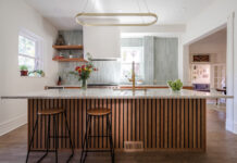
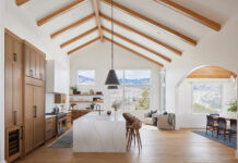
At first glance, Larrimer’s kitchen appears to be a classy-yet-colorless combo of slate flooring and gray (lower) and glossy white (upper) cabinetry with black-accented channeling throughout. “I didn’t want it to be all wood, and I didn’t want it to be too dark,” she says. Further examination reveals an era-appropriate terrazzo pattern in the countertops that offers flecks of sagey green that play off the paint and furnishings in the living room in the open-concept space.
Larrimer’s husband is an artist, so knowing her love of vintage sitcoms, among other elements of pop culture, he painted the portrait of Mr. Furley, actor Don Knotts’ iconic Three’s Company character, that hangs above the kitchen table. The subdued artwork contrasts the rough texture of the brick fireplace and complements the mauvy pink velvet of the chairs.
In the living space, the midcentury hues—“a lot of teals and greens, mixed with orange and reds and mustard”—come alive. The Soto chair and ottoman are a classic style from Joybird in a bright fabric called Sunkist. The rug is a very pale shade of mint, and the wall color is Sherwin- Williams Greenblack. “Truly, personally,” says Larrimer, “green is my favorite color.”
Above the sofa is a Jackson Pollock-esque painting that Larrimer and her husband mutually created to bring all the pigments—bright, dark, and midrange—together. “I had an idea of what I wanted,” she says, “so we broke it down into a base painting in the dark green, and then added the light green, and then added the coral, and then a little bit of the mustard.”


